弗兰克有机苹果包装设计
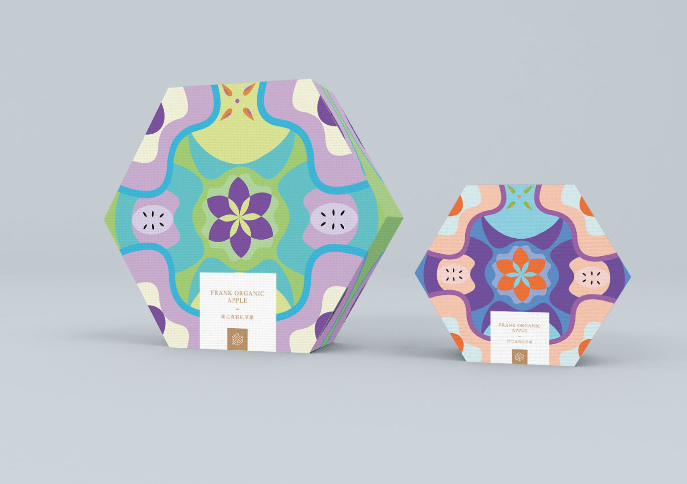
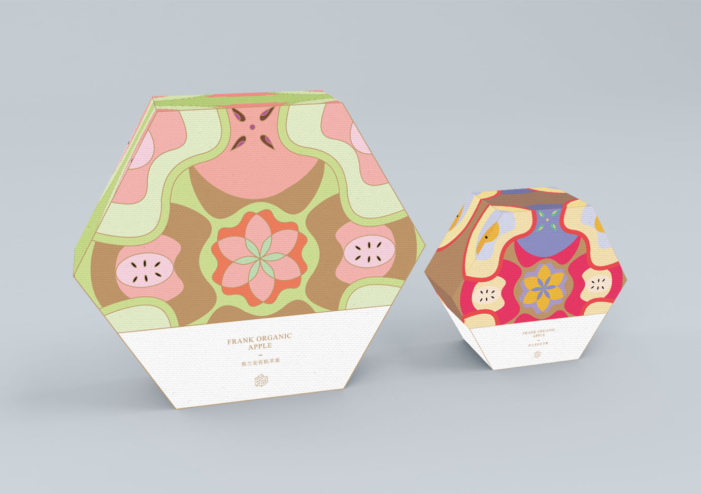
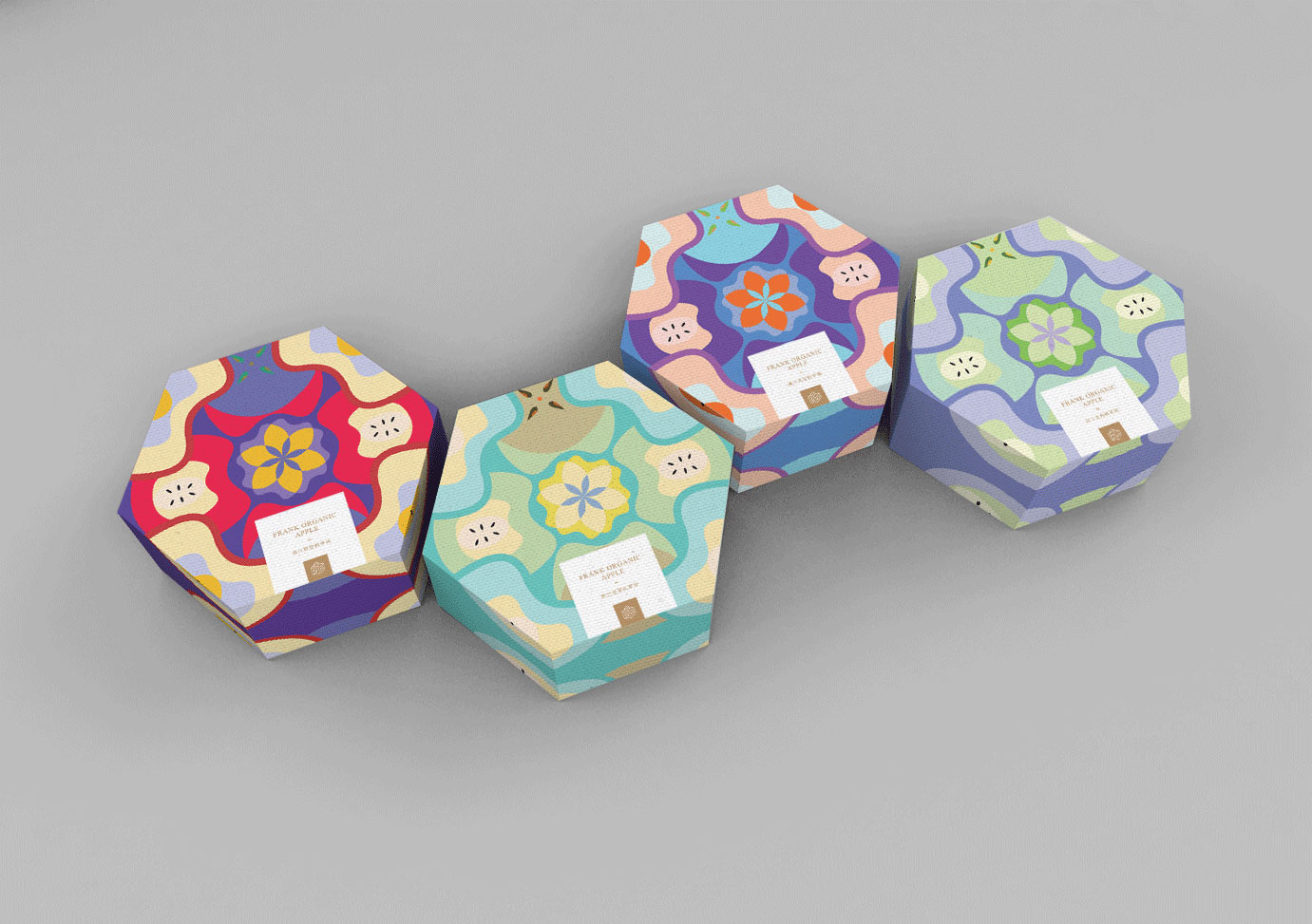
弗兰克有机苹果包装盒采用稳定的六边形设计,颜色上选择小清新风格的色调,既方便运输,也适合客户送礼的礼盒包装。
为了表现产品的“天然、健康”的品牌特性,包装画面采用苹果的横切面为原型,搭配象征“阳光、水源、甜蜜、清脆”的四种颜色组合,使整体呈现出自然清新的视觉感。整体的设计打破了苹果传统包装的单调性,让人耳目一新,充分体现出品牌的独特风格。
-
This is a packaging design for Frank Apples. We took a selection of drawings of apples as the main element. We used the color of fruits like pink and green to illustrate the fresh and organic nature of their products.